If Essie released a desert collection, I think it would look a little something like this:
Welcome to Essie Desert Dusk collection. This collection is inspired by all things desert. I pulled inspiration mostly from the sunset/dusk part of the day where the colors are most vibrant and stunning, yet the warm tones are still ever dominant.
Desert aesthetic is quite popular these days because the color pallet of warm tones and ridged textures are quite relevant in both interior and graphic design. Do you have any favorite digital art Instagram accounts? Chances are they are quite earthy in the color pallet they’ve chosen. You heard it here (probably not first though!) folks, grays are out! (unless you are trying to sell your home. Don’t paint the walls beige. Gray still dominates that market).
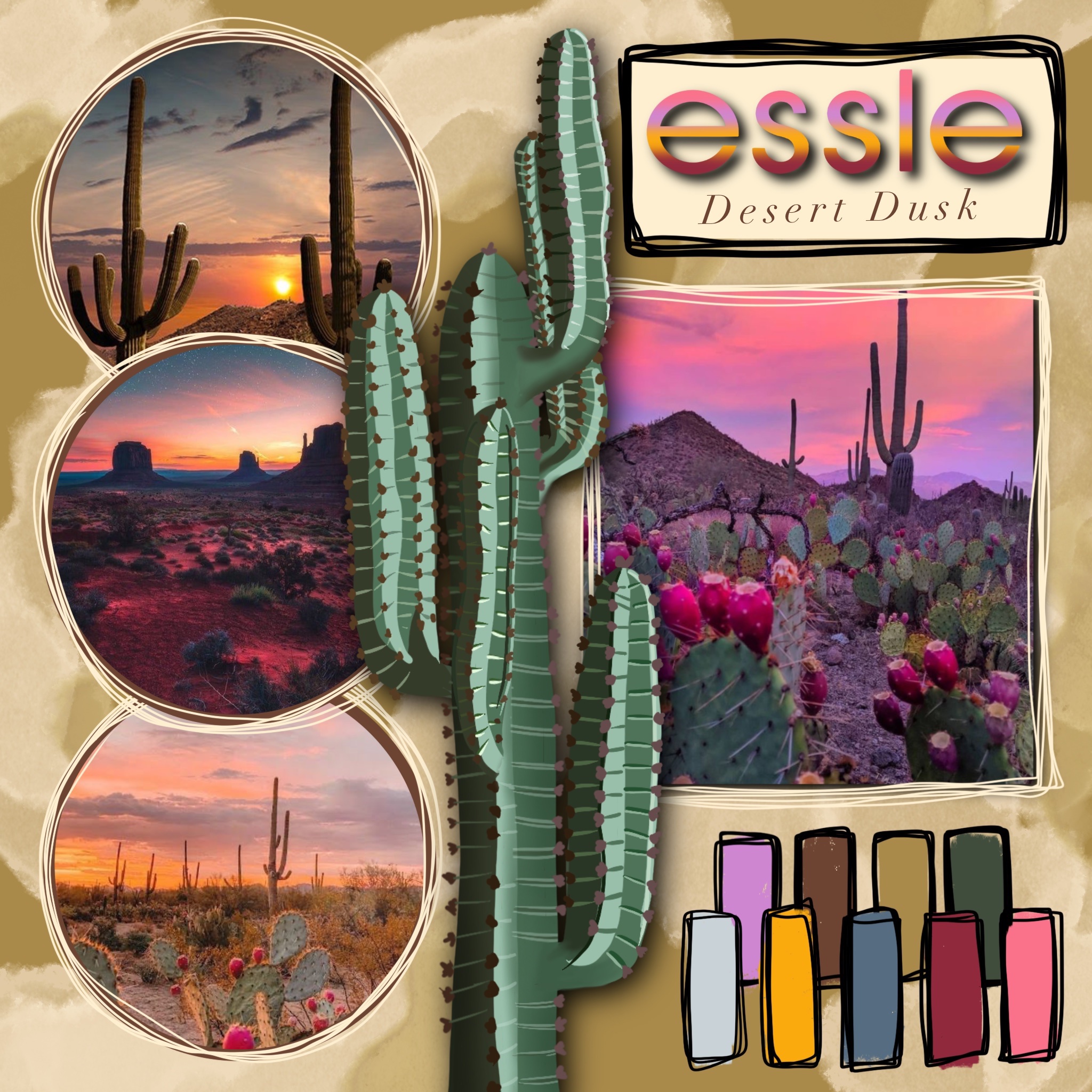
I think earth tones are in because its grounding, warm, and comforting. With the effects of the pandemic raging on, I think the energetic qualities of earthy tones are highly comforting. I think earth tones will be around for a while.
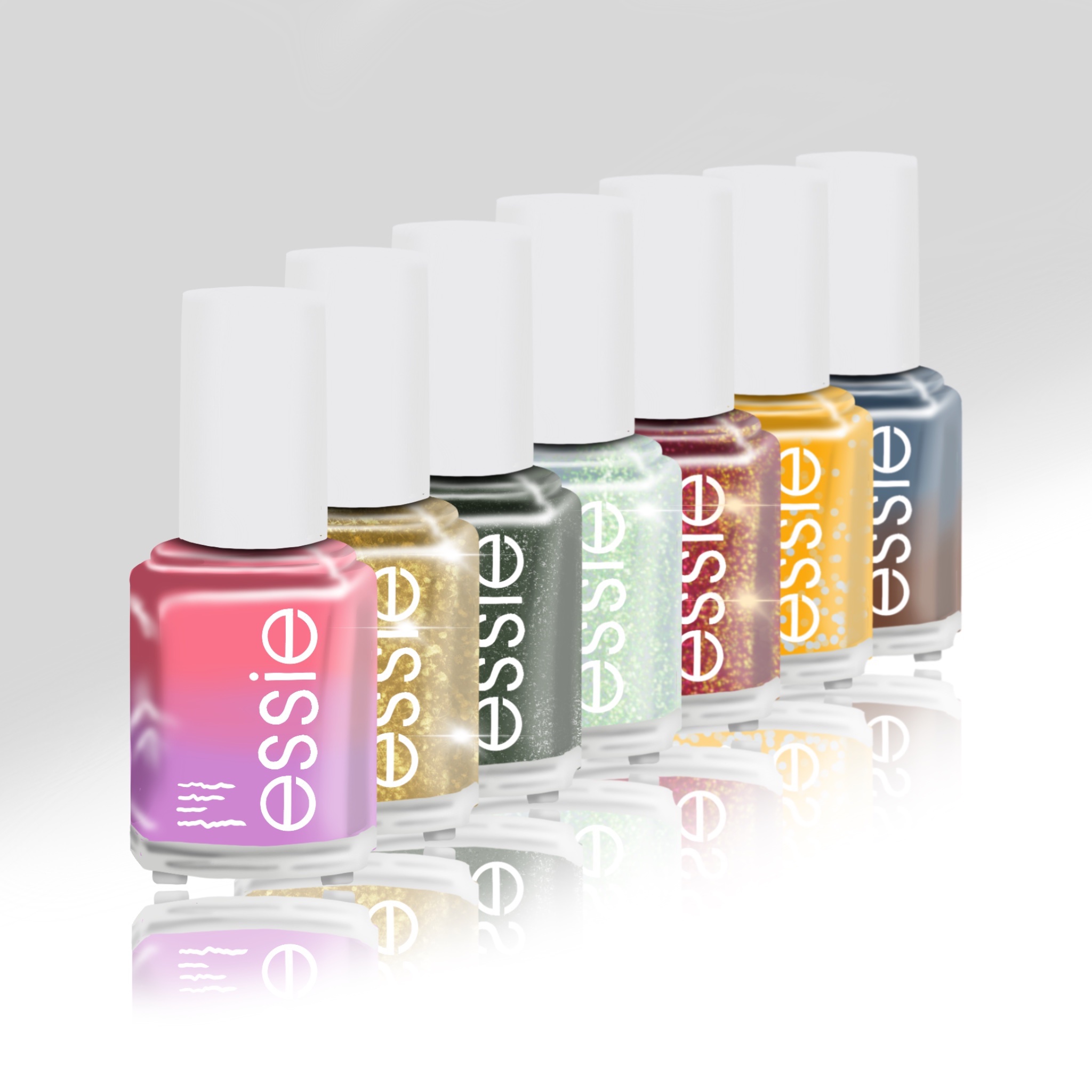
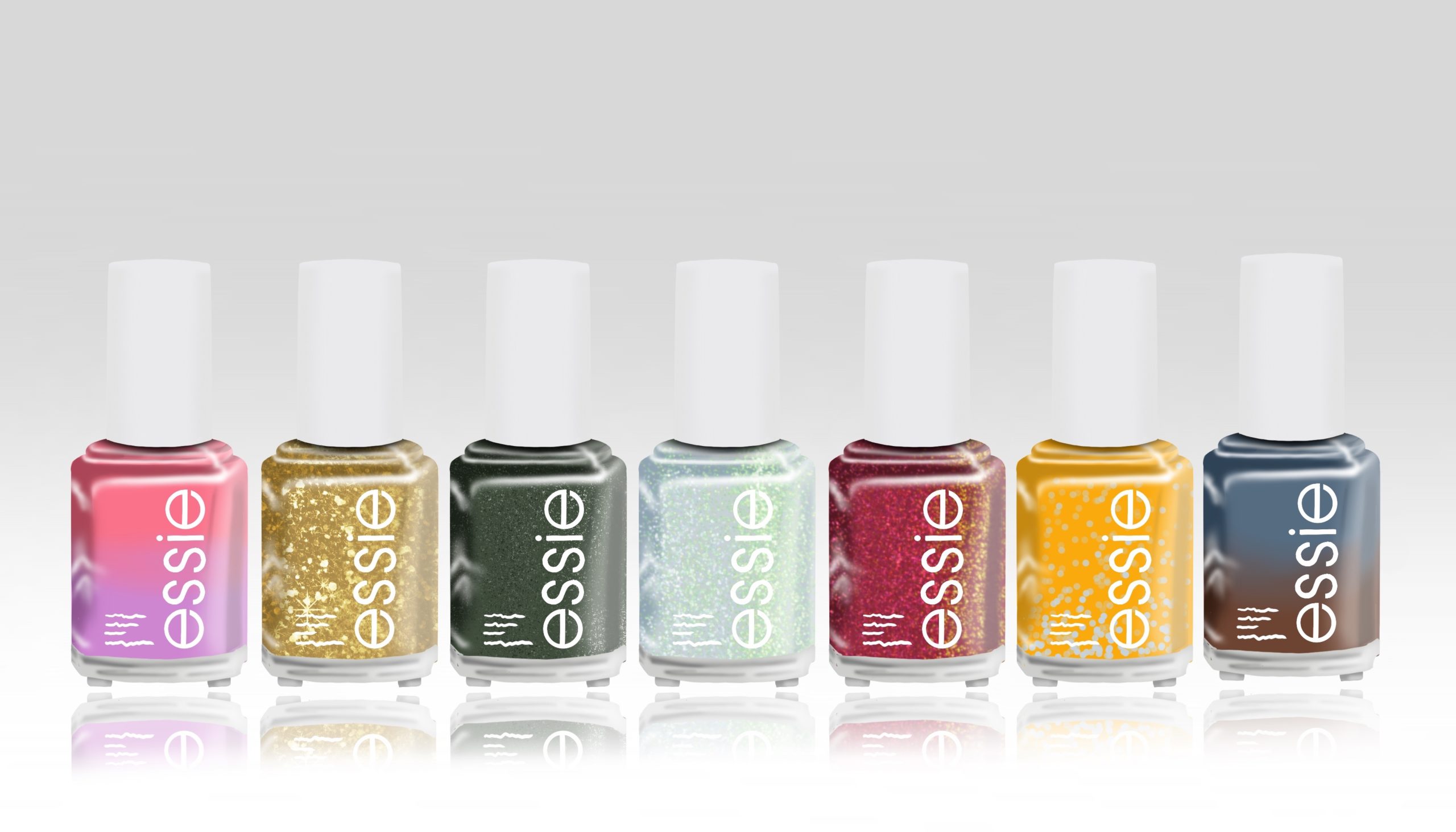
Here are the color names I’ve chosen from left to right. If you know of any dupes out there for these colors, help your sister out!! Post it in the comments.
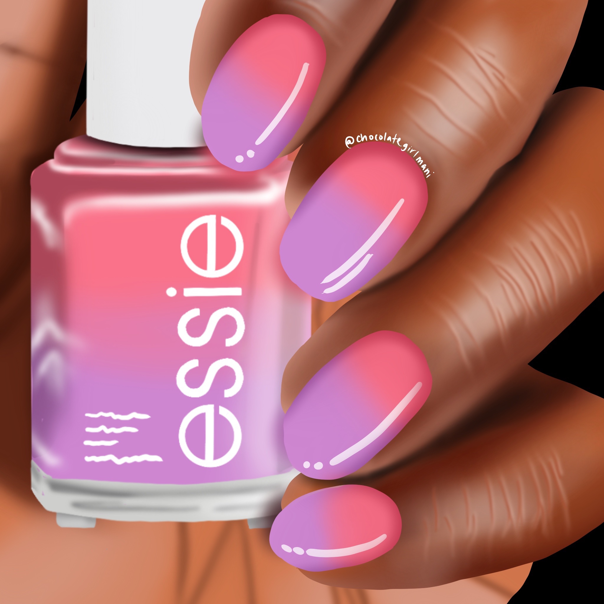
Desert Sunset – This is a crème-thermal bright (almost) salmon-y pink (warm) to rich lavender purple (cold).
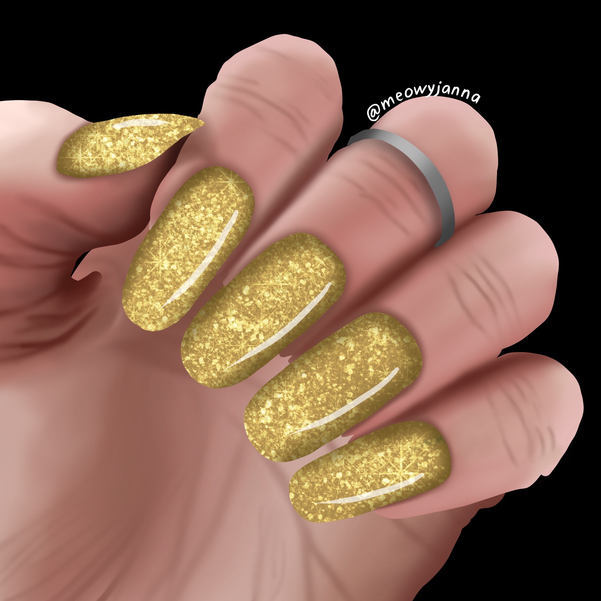
Sandy Reflections – This is a golden with a slight edge to chartreuse glitter-bomb.
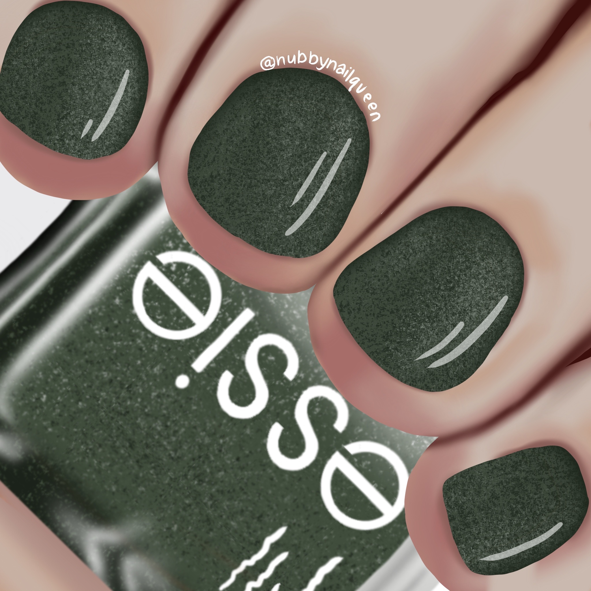
Everlasting Cactus – This is a deep-evergreen. Its an earthy evergreen though. Not a blue leaning evergreen. It has some black micro-glitters and some white micro-glitters.
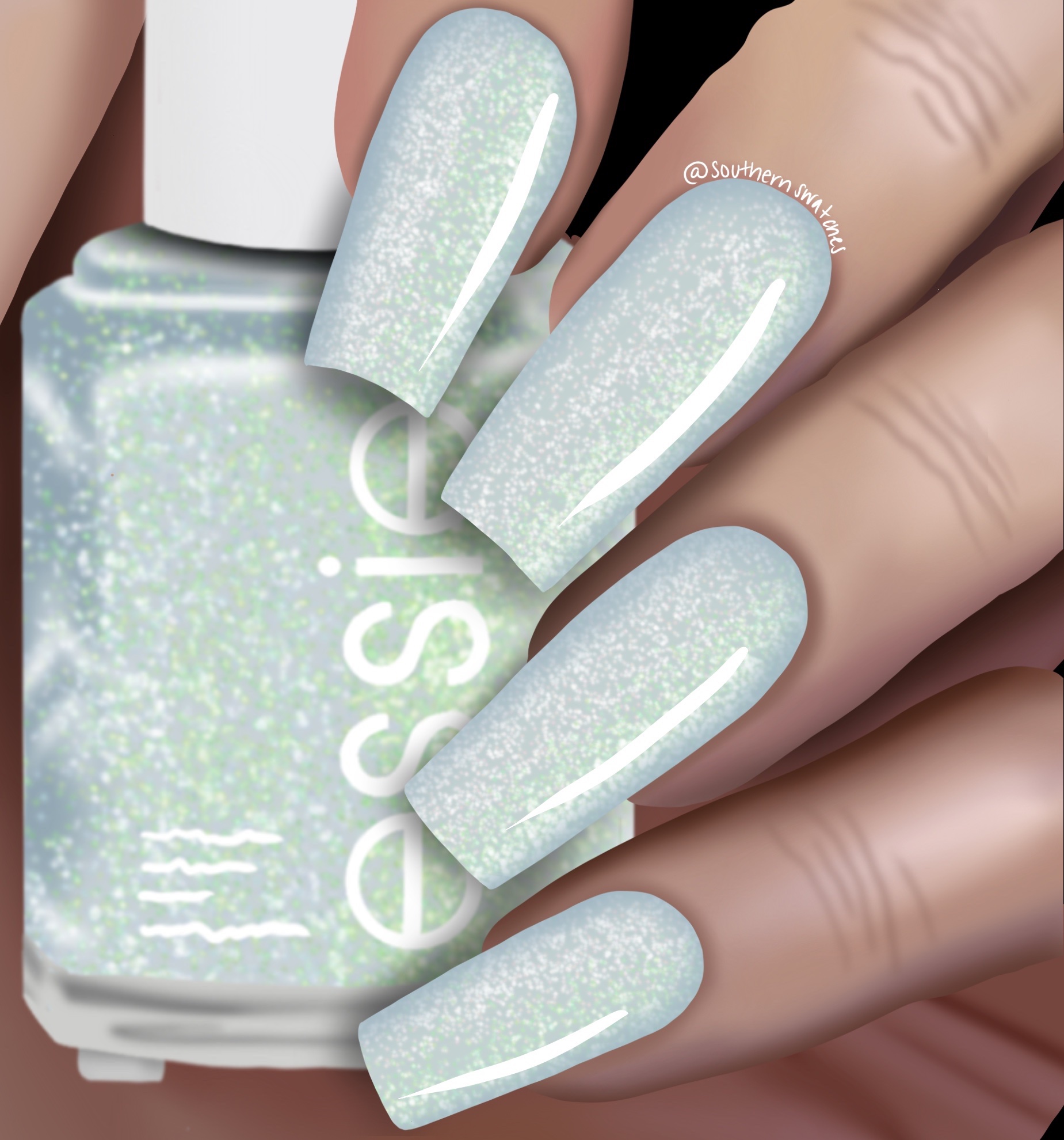
Refreshing Water – Soft, almost white, blue with white and sage green shimmers. Very glowy. Think Ethereal quality glow (if you know, you know).
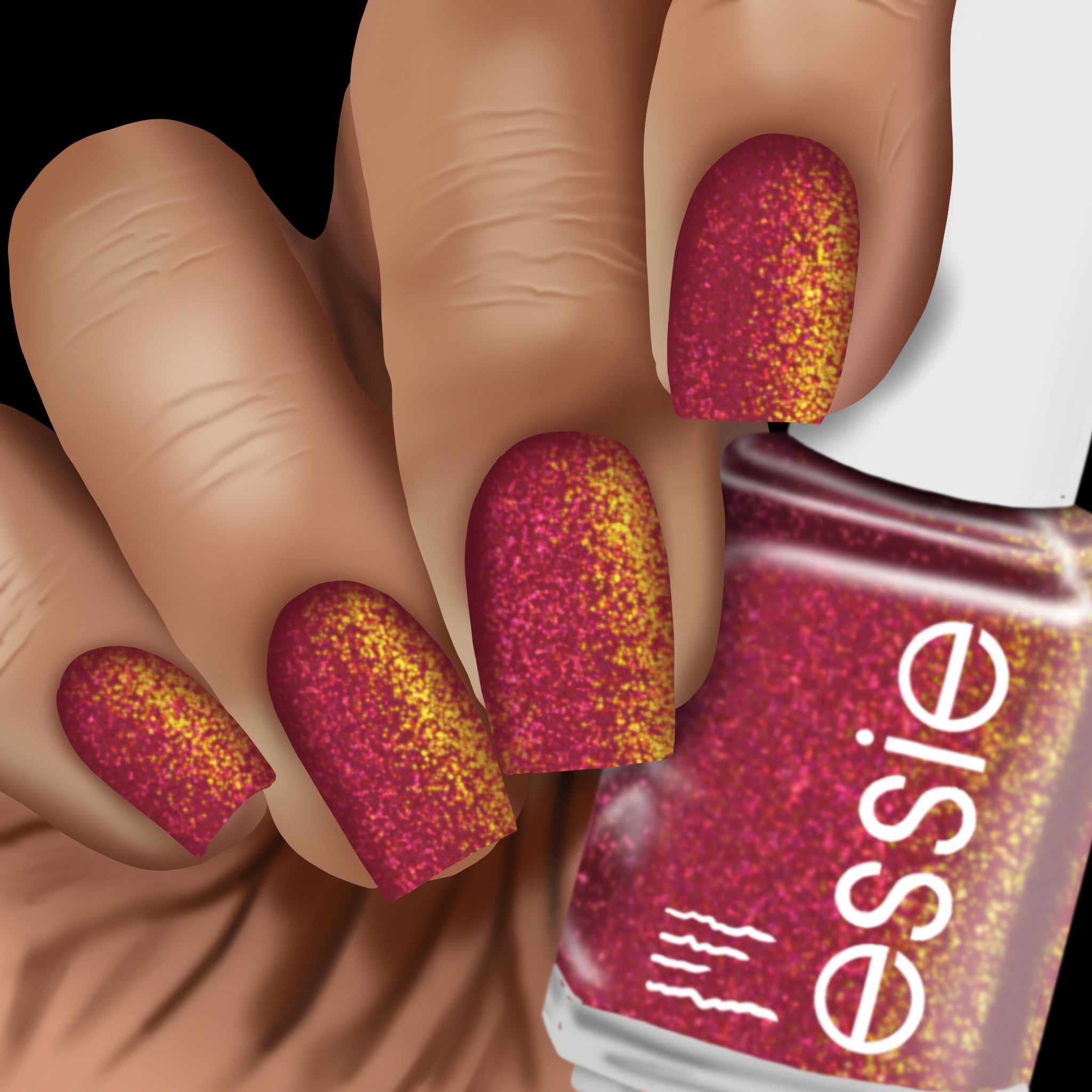
Reflective Red – When the sun goes down in the desert, that is this color. It has a nice warm shimmer of gold and bronze when it catches the light at an angle.
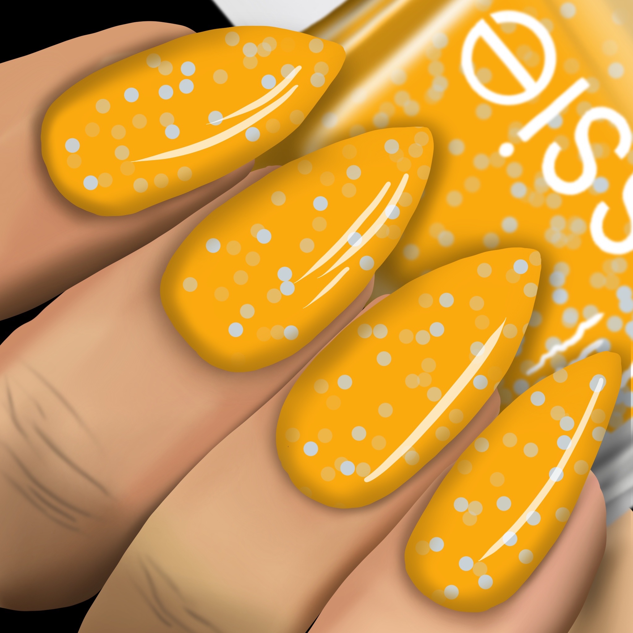
Dandelion health – Did you know that the basic, yellow dandelions that are pests in your yard are nutrient-dense from flower to root!? They are! This crelly yellow with soft, matte blue circle glitters is an ode to them.
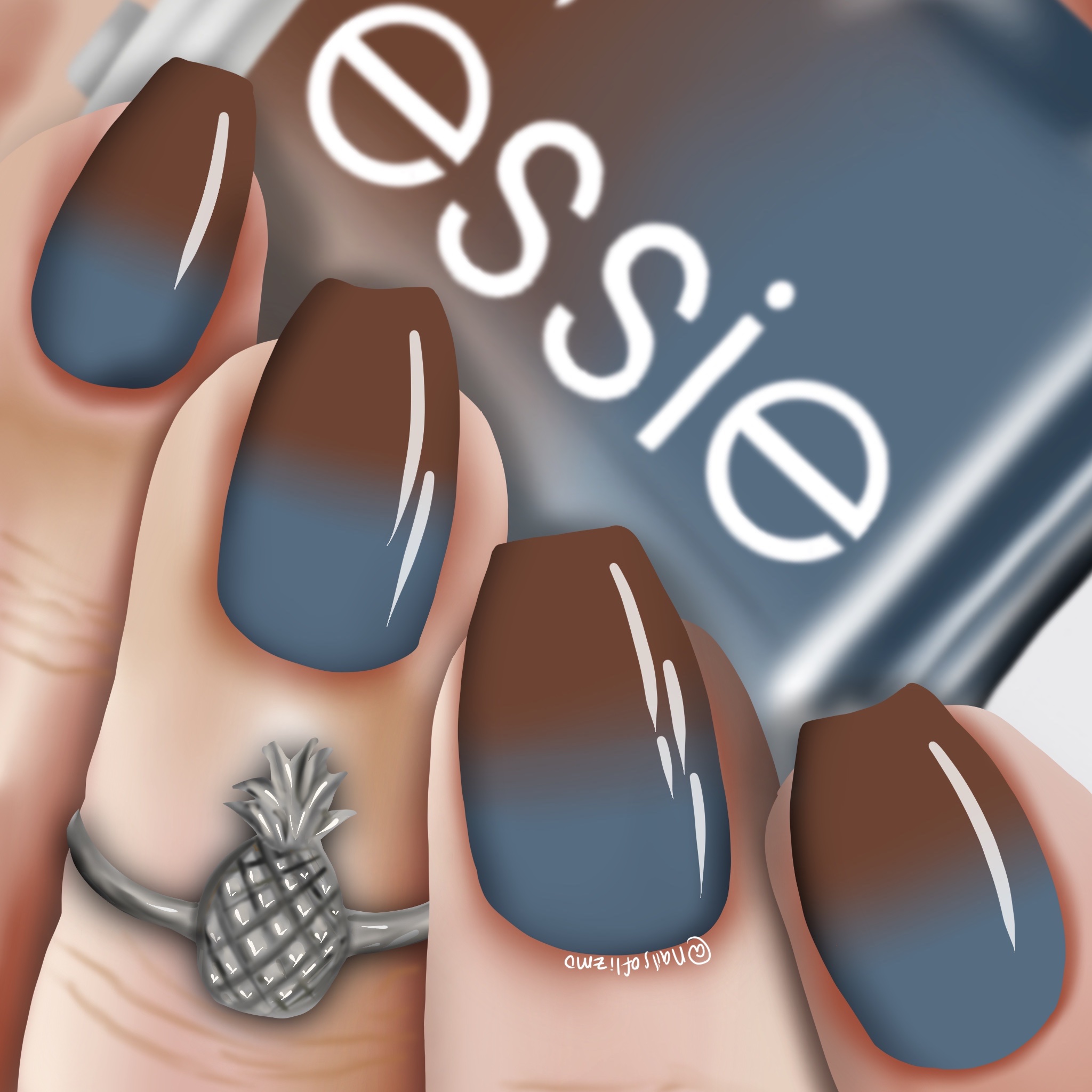
Warm Days, Cool nights – This is another crème thermal. It’s an earthy, warm blue (cold), to milk chocolate brown (warm).
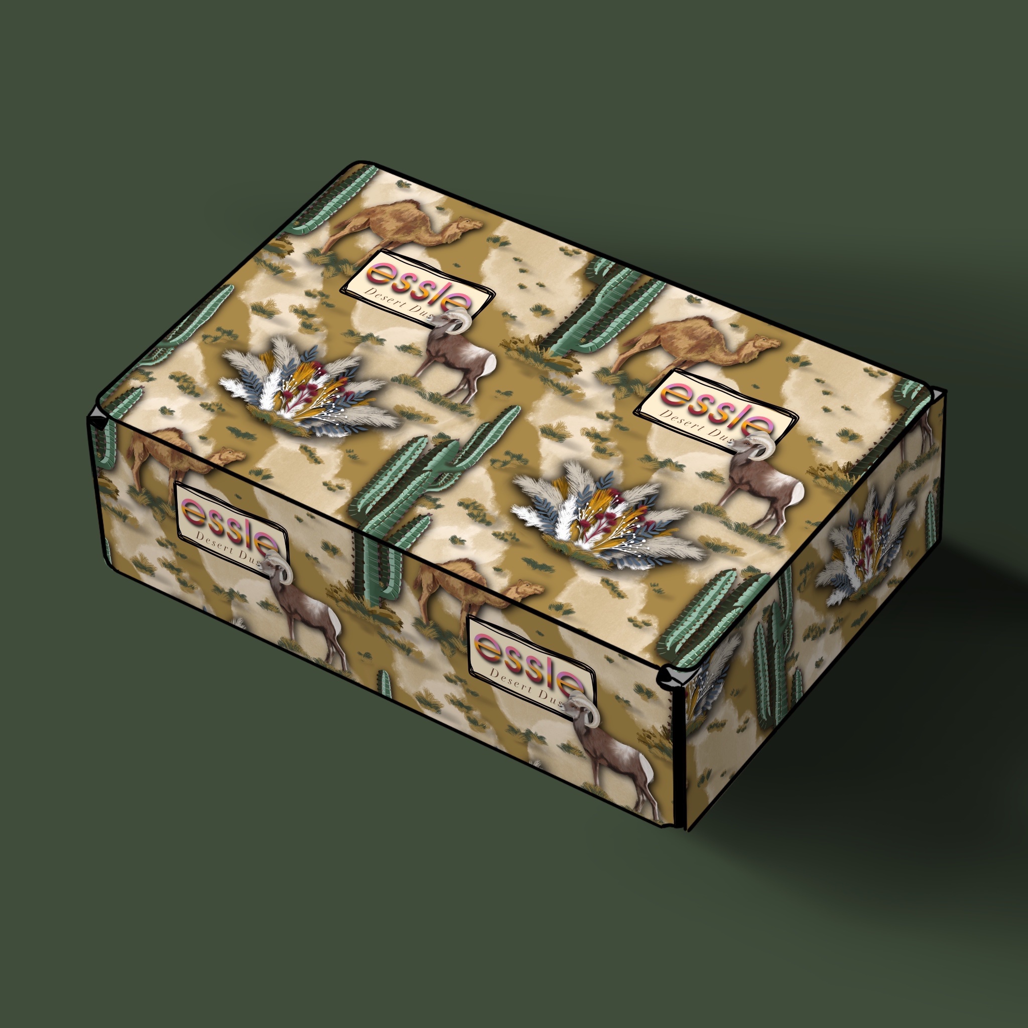
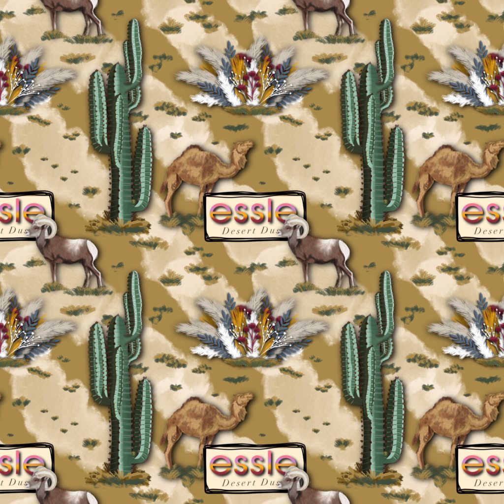
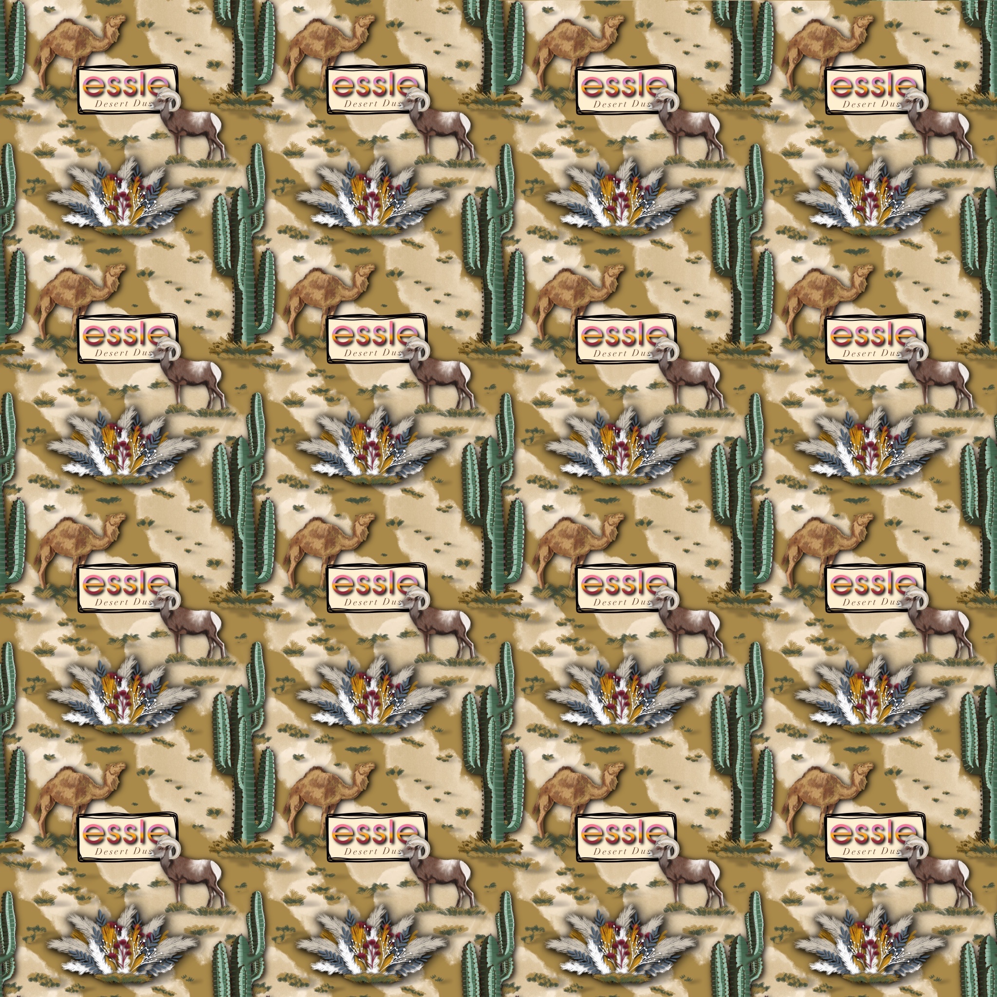
And lemme tell ya, the repeat pattern on the box was QUITE a challenge for me to solve. It took me 8 hours to do so here are a couple shots of that because it needs to have its own glory all by itself.
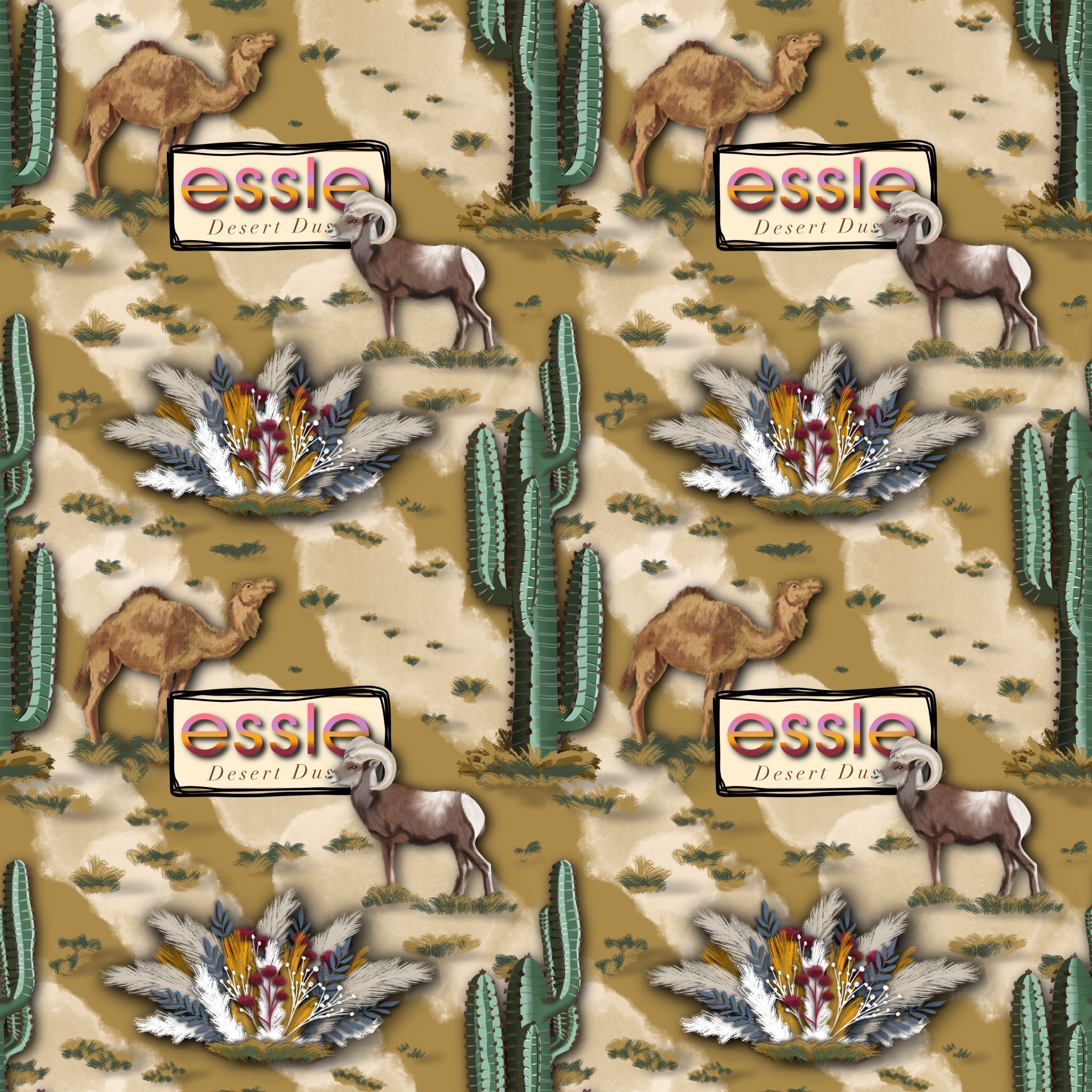
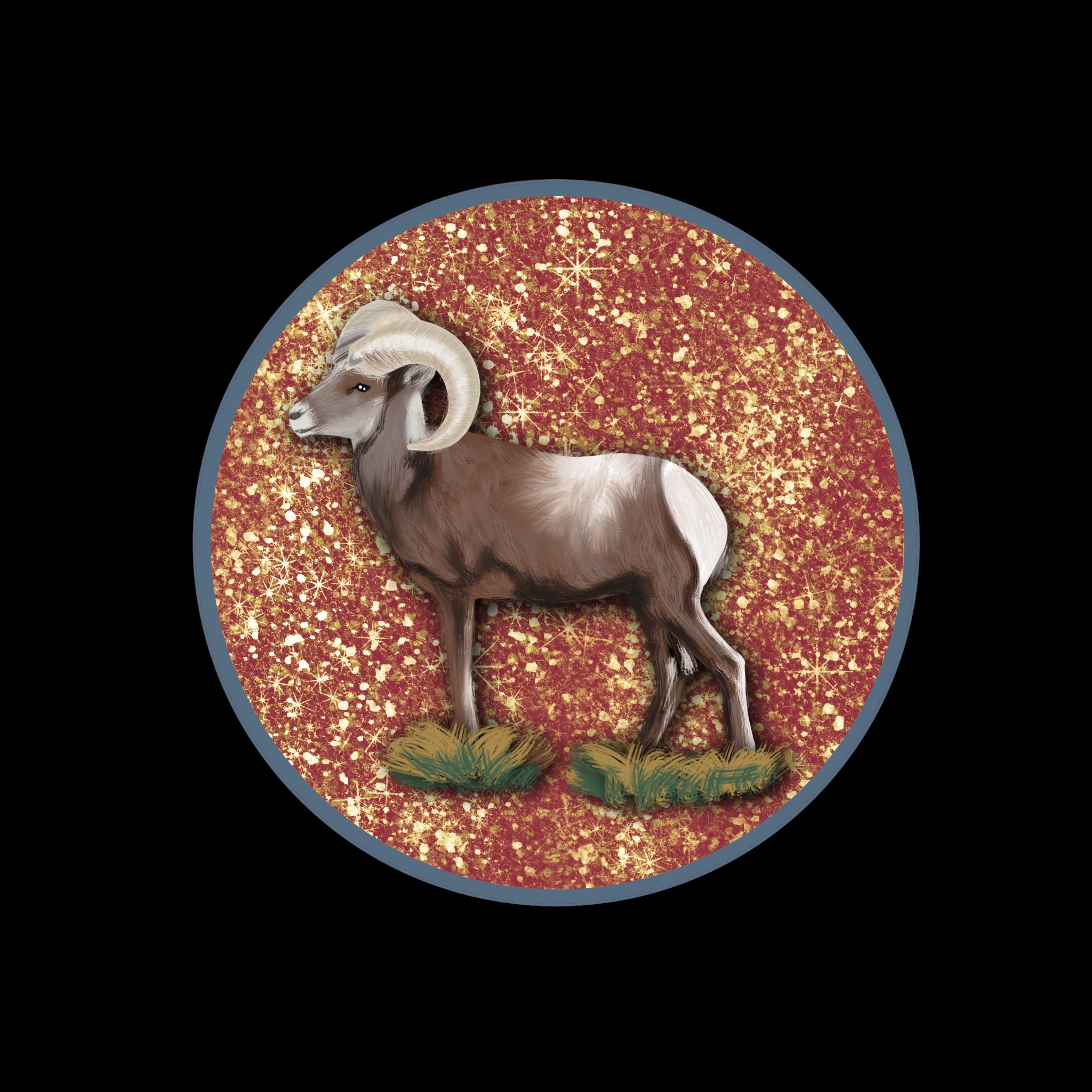
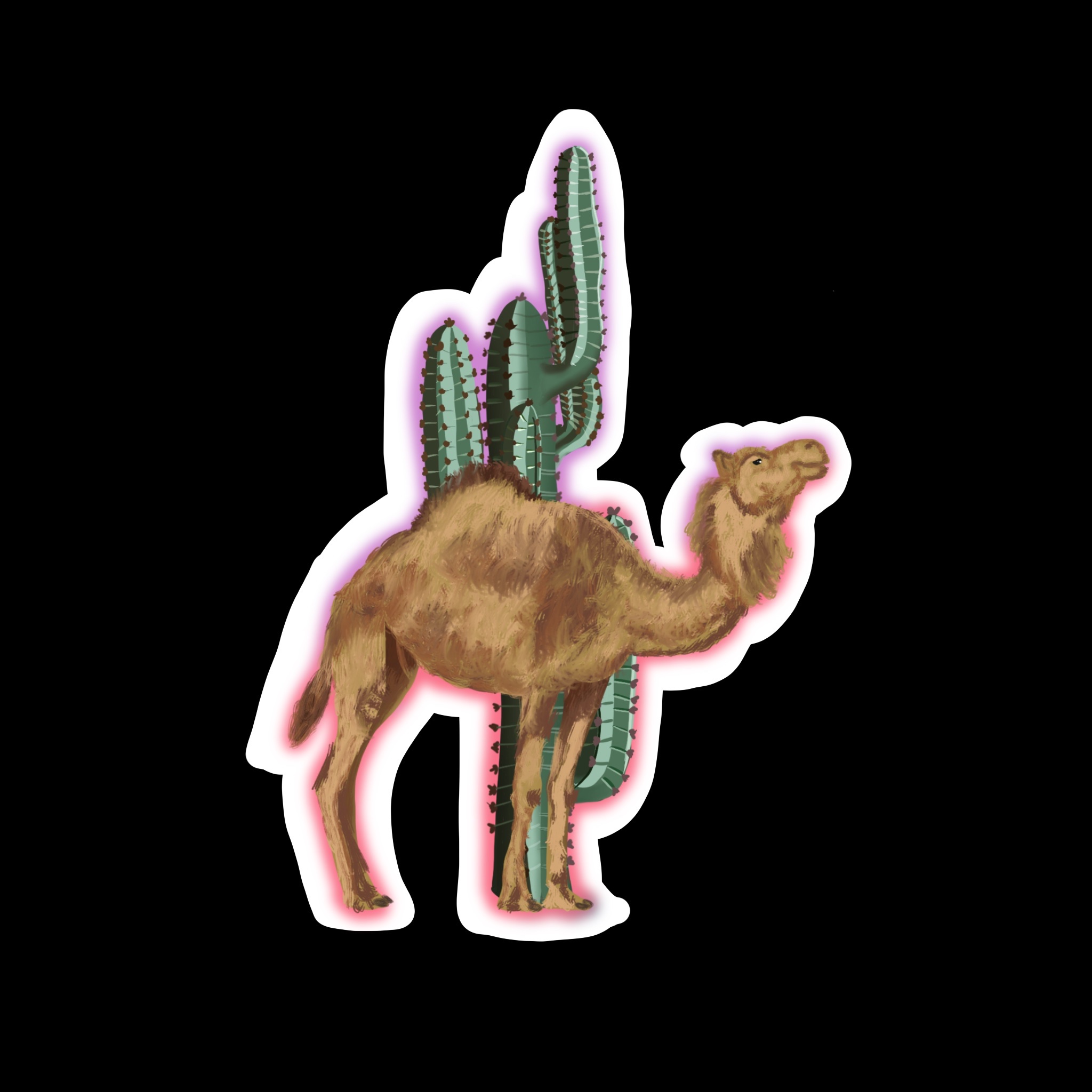
And here are the sticker designs I made for this project:


And now for some swatches:
Thanks for reading my VERY FIRST BLOG POST EVERRRR!! I have an entire arsenal of collections to share with you. Follow me on social media or, even better, subscribe to my email list! I will send out monthly emails with my latest collections so you can binge them all like you do Netflix. #bingelife.
If you like it, share with some friends. If you don’t, sorry. And if you have a suggestion for a themed collection, holla at ya gurrrrl.
